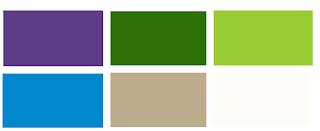
This is a really rough plan of an idea of what I want my college magazine cover to look like. At this stage I have no idea if my actual magazine will look anything like this, but this is my starting point. I tried to play around with the layout a little, and some things may not work but I thought I would be a little unusual, rather than stick with the conventional plan of having the masthead on the top-centre. I will continue to develop this idea into my final magazine cover design.


No comments:
Post a Comment