I think that this photo was taken from too far away. I should have zoomed in or stood closer to take a more appropiate photograph. It is also taken in landscape which wasn't what I wanted for my design.
I like this photograph although like the one above I think it was taken from too far away. I don't like the metal poles being in the picture, but I do like the look of this building on campus as it gives modern and expernsive connotations to the college.
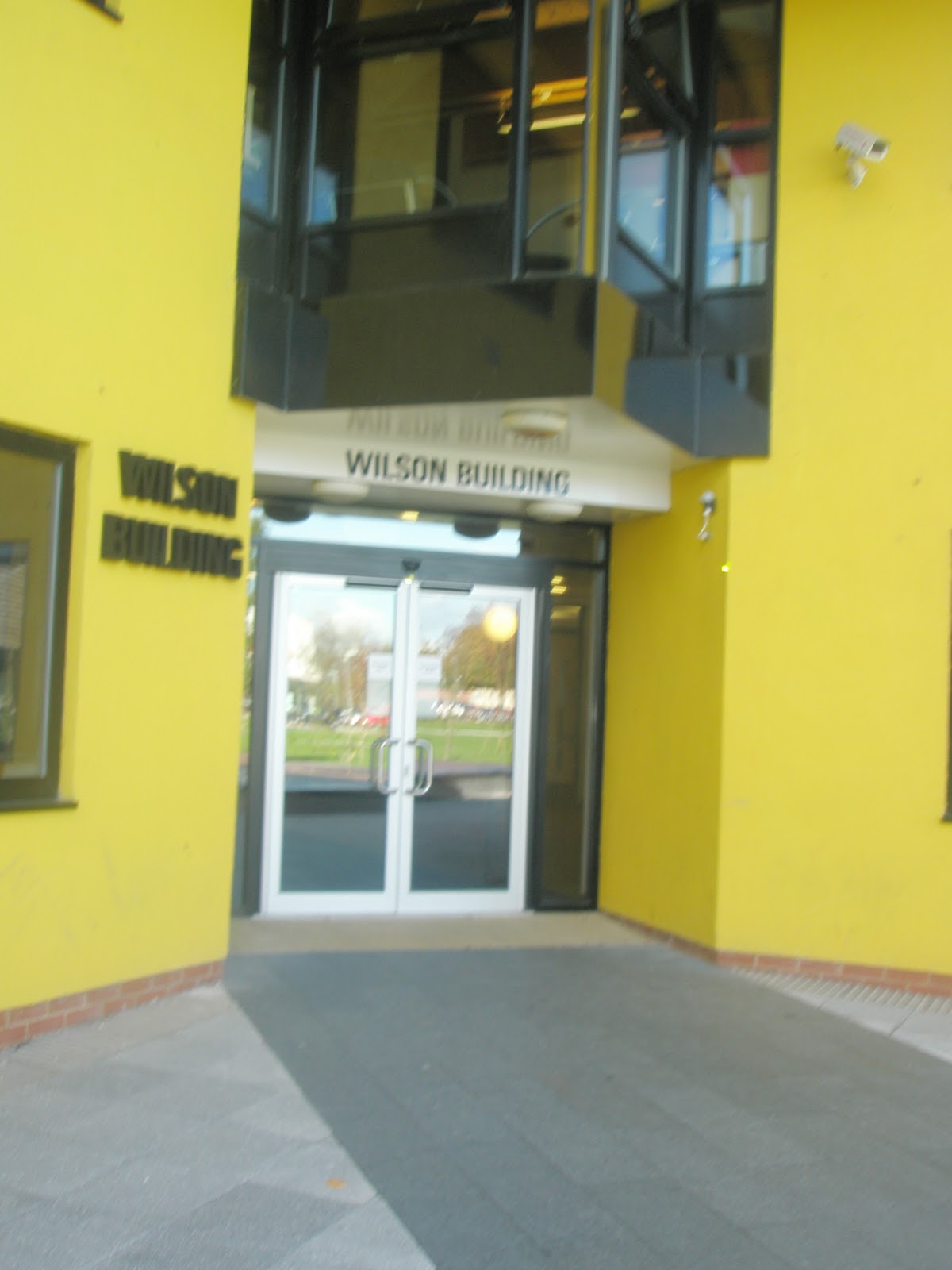
I have decided to not use a photo of this building in my magazine as the bright yellow clashes with the colours- purple, green, blue or white I am using on my magaizne.
I am going to use this photograph as the background of my contents page. I have already said that I like the look of this building, but inlike the other photogrpah I have taken of it, this one is from closer up; giving it a more defined, detailed look. The metal poles are also out of the photograph, which is what I wanted.
This photo is of the newly opened bulding on campus which would have been a good DTP to use for my contents image as it shows off the college's new facilities. This isn't a very good quality photo though, it's too dark and the camera is slanted slightly. I don't like the way this photograph has turned out and I won't be using it in my design.
Photos of the college campus for my college magazine.


No comments:
Post a Comment