Wednesday, 20 October 2010

Final Copies and evaluation.

Our brief states that we had to create a cover page for a college magazine and a mock-up of a contents page- which I then designed. I decided to call my college magazine 'Wyke Entertainment' which I then abbreviated to 'W.E'. I wanted a name that would appeal to my target audience of students aged 16-18 that attend Wyke College. This abbreviation really means 'whatever' in cyber language, so I thought that this would be a good way to draw in attention. The colour of the masthead is a bright purple colour. Purple as I have already mentioned in an earlier post gives connotations of success, which makes it a perfect choice for a college magazine. As well as this it maintains the house style of the college website, which will help make the magazine instantly recognisable to students. The font that has been used for the masthead is made from block squares, which gives connotations of cyber and technology- which students will recognise, appreciate and easily relate to. I think that by using this font it gives the magazine young, fresh and funky associations to it. I am glad that I outlined the masthead in black as it does make it stand out from the background. Because we were taught to read from the top left of the page; this was a perfect place to position my masthead as it is the first place people look.

The main image I used is a student dressed in smart, casual clothes smiling. This gives the college a positive representation as she looks as if she is genuinly having a good time at college. The pose the model is doing is neutral, she is just stood there as if she was stopped walking to her next lesson at college. i chose to do this in order for the main image to stop looking too fake.The students in the background help with this too. The girl has a folder- causing her to look ready to learn. The black folder gives a professional connotation to it and reflects the black of the headlines and article titles. I like the way the college campus is in the background as it shows off the facilites at the college, and gives a modern, expensive feel to my magazine cover- without taking too much attention away from the female student.

The headline is super-imposed over the students torso which instantly draws attention to it when people look at the main image. It is written in black which contrasts the colours of the background. The colour black is usually used in order to connote power or strength. I used a block, bold font which gives it a professional edge, without being too formal. The captions under the headlines are in either green or purple which again establishes the house style of the college website and makes the magazine seem more organised and put together as appose to random or tacky.

I followed the usual conventions of a college magazine and included a website at the bottom of the magazine- allowing the students to gain further knowledge. As well as this, the magazine cover is dated. This was done to allow my target audience know if the information or advice the magazine is giving them is valid or necessary. I also used a bar-code in the bottom right to establish how many issues were being distributed to the students. I used the same colours all the way through my magazine, and I also decided to use similar fonts for anchorage. In my opinion I think that this gives my text a prestigious quality to it, whilst still maintaining to relate to my target audience.

If I had to re-do my cover the first thing I would do is to get more input from my target audience. Although I did do a questionnaire, I could have gotten students to comment on my finished product in order to make my text more relatable to my peers. I think that my cover isn't too busy and has the right amount of things super-imposed onto the background, although I would have liked to play around a lot more with the layout and maybe create something unique or completely different from a college magazine.


Overall I am really happy with the way my contents page turned out. I eventually settled on using a DTP of a building on the college campus as my background as it could remain constant every time a new magazine is brought out- this would mean the magaizne is recognisable to students. It also creates an organised look. I placed a purple square with curved edges for a modern twist on the left hand side of the page. The purple maintains the house style, wheras the box creates attention which is why I decided to put the contents of the magazine in this box. The colours of the articles use blue, white, purple and greens which maintain the house style the cover has established. If I had to re-do this task however I would have made the titles stand out more, possibly by fading the background image, or brightening the font. I would do this because the text doesn't really stand out as much as I would have liked, and almost gets lost in the background image. The numbers of the pages are large and bold which draws the eye of the reader and ensures they don't waste time searching through the magazine for the thing they want to read.

The photos on the right hand side of students are aesthetically pleasing and help give a positive representation of the college. As well as this they create an ideology to the contents page. Because they are all smiling they are saying that if you take the advice this magaizne is giving; you too can be happy at college too. The images represent the main articles in the magazine which is a typical magazine convention. The masthead 'Contents' uses the same squared font as the masthead on the cover which obviously makes it look as if they are from the same magazine and not mis-matched like on some of the magazines I analysed.

I tried to use the name of the college as many times as appropiate in the magazine. This was purely to directly address. As the target audience are all students from Wyke College they would relate to the things this magazine is saying. As well as this, it creates an intelligent yet snappy connotations to the headlines 'Hunger strike at wyke' rhymes and could appeal to the target audience more. It is much like a headline in a real newspaper. At wyke college, we have merchandise such as hooded sweatshirts with @ wyke on printed on to them. Therefore by using this phrase it creates a bond between reader and magazine and makes it easily relatable to students.

I used media technologies such as photoshop and a digital camera to capture and edit my digitally taken photographs for this project. This allowed me to gain a more detailed knowledge of how to use these technologies for my main task. It also gave me practice and allowed me to draw and develop my media skills. I learnt a lot from my audience feedback, and without the help of my questionnaire my text wouldn't look the same. This is because I tried to use everything my target audience suggested in order to make it more accessible and something students would actually want to spend free time looking at. I think that my product was effective as I sucessfully did everything in the breif and more. I also feel like I really pinned down what my target audience wanted for a magaizne, and didn't create an ordinary, boring piece of text. I feel like I put my own spin on typical magazine conventions.

More photos.

I think that this photo was taken from too far away. I should have zoomed in or stood closer to take a more appropiate photograph. It is also taken in landscape which wasn't what I wanted for my design.


I like this photograph although like the one above I think it was taken from too far away. I don't like the metal poles being in the picture, but I do like the look of this building on campus as it gives modern and expernsive connotations to the college.
 I have decided to not use a photo of this building in my magazine as the bright yellow clashes with the colours- purple, green, blue or white I am using on my magaizne.

 I am going to use this photograph as the background of my contents page. I have already said that I like the look of this building, but inlike the other photogrpah I have taken of it, this one is from closer up; giving it a more defined, detailed look. The metal poles are also out of the photograph, which is what I wanted.
This photo is of the newly opened bulding on campus which would have been a good DTP to use for my contents image as it shows off the college's new facilities. This isn't a very good quality photo though, it's too dark and the camera is slanted slightly. I don't like the way this photograph has turned out and I won't be using it in my design.


Photos of the college campus for my college magazine.

Change of Plan.

I have completely changed my idea for my contents page. Instead of having students as the main image, I want one of the college campus. I think that this would be a better idea as it would stay constant every week, and therefore be reconisable to my target audience.

Contents Page.

This was the plan of my contents page. However I don't really like the way it has turned out and I thihnk it looks unprofessional. The purple reflects my house style which is a good thing, and I like the transparent box as you can still see the photos underneath. I do not like the way the photos are overlapped, and I think I should use a wider variety of photographs to show off the college. The font is the same as the masthead on my cover and I will still probobly use it to establish a house style.

I really need to think, and plan what to put on my contents page. I should maybe draw another spider diagram, or experiment more on photoshop in order to create a contents page I am happy with.

Tuesday, 19 October 2010

2nd Draft.


I have moved the position of the masthead, and I think it looks better here, it also fits with the conventions of a college magazine cover. The limitation of doing this however, is that it doesn't stand out as much as it used to, my target audience could also find it hard to understand as it is super-imposed on top of the college campus. I will experiment with different ideas and may fade the background so it draws the readers attention, or I may decide to put a thick blakc line around the outside of the lettering.

Development of 1st draft.


I have managed to alter the colour of the captions for the sub-headings and I think they look appropiate for my text. They look young and funky as well as maintaining the professional feel I want. As well as the captions, I changed the colour of the date of the magazine and the college website. I did this to keep in touch with the house style of the college website and to make them stand out and not look as ordinary or plain.

1st Draft.

This is the first draft of my college magazine cover. I like the colour of the masthead as it's bright and demands attention. The colour links to the house style of the college website which I intended to do. I like the font I decided to use for the masthead as it connotates technology which my target audience- students are interested in.

I think I will move the position of the masthead from the top right, to the top left. This is mainly because it is a convention of a magazine cover for the masthead to be on the left hand side. This is because we have been trained through reading from a young age to look to the top left first. Also, magazines are displayed in a way only the top left of the magazine is shown, if my masthead is not there nobody will know what it is and therefore will not pick it up to read it.

I like the range of sizes of the anchorage on my text. The main article title is the biggest as it implies this is the most important thing in the magazine. There are small captions underneath the sub-headings which give the audience a little more information about the articles. I would like to put these in different colours- maybe a purple or green. I would like to do this as it will draw the audience's attention as it will stand out from the text, as well as this it will give the magazine connotations of trendiness. It will also connotate youth and freshness. Using a purple or green colour for my captions will also reflect the house style of the college website.

Thursday, 14 October 2010

Fonts.

I think I have decided on the magazine name :
W.E
Wyke Entertainment

I chose this one because I think it appeals to my target audience of students more because it is essentially slang or 'cyber-text'. Students will think W.E stands for 'whatever' but I think this spin on it makes it seem more funky and communicates the fact that it is a magazine for students. Wyke Entertainment is an obvious name for a college magazine and isn't that creative but it's conventional and is expected. It also tells you straight away that it isn't a general magazine for students, it is produced for the students of Wyke Sixth Form College.

I have been experimenting with fonts for my magazine name and I wanted it to reflect the cyber feel to it. So I have tried a few block fonts. I may not decided to use them in the end, but I will superimpose them on my cover to see if they do or don't work.


Photos I want to use.


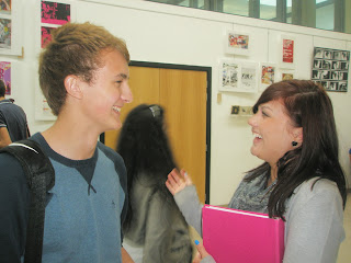
 - I really like this photograph and think I will use it for my main image on my magazine cover. First of all it meets the breif- it is a DTP of a student in a mid-length shot. As well as this it meets the ideology I want to create with my image, the girl is smiling which makes the audience believe that she is happy to be at college. The background of the photograph is appropiate as not only is it any college campus, it is the campus of the college I am using for my magazine. The girl is dressed in fashionable wear which will make my target audience more aesthetically attracted to my magazine as she looks trendy, fresh faced and friendly which is something I have never really thought about doing until now. The folder in her hand makes her appear more student-like which was intended, and the people in the background make the photograph look real as oppose to staged. She is also looking at the camera which draws attention and creates a bond with the reader.


-Although I won't use this photo for my main image as the stdents aren't looking at the camera I am intending on using it elsewhere; such as the contents page. I really like the friendship communicated in the photograph which gives a good representation of the magazine. The students appear to be learning and the smiles creates the ideology I want for my text.


- I like this photograph as again it shows a friendship between the two students, which creates a good representation for my magazine. The folder in the DTP makes the image more student-like and the background is appropiate. I may use this on my contents page.
-This image like the others help me create a good representation of students as they all look friendly and intelligent. They are all smiling so they look happy also. The photograph was taken outside so it makes the college look a nice place to be as it shows the students enjoying some free time.

Wednesday, 13 October 2010

Photos


These are some of the photos that I have taken for my college magazine, I know that they aren't all mid-length shots of one student which is required for my main image, but I thought that I could use other photographs for the contents page, or I may decide to use smaller images on my cover also.

Tuesday, 12 October 2010

Article Ideas.

I need some articles to go on my front cover to draw my target audience in and make them want to read my magazine. Here are a few ideas of what they may be.

Article Titles

Hunger Strike @ Wyke
The truth about the shocking portions.

Exam Jam
Revision parties hit an all time high.

Wyke Worries
Send in your problems to our very own Agony Aunt.

Be An Editor
Send us your work and WIN the chance to edit this magazine.

Magazine names

One of the hardest things for the preliminary task  is to think of the name for my college magazine. I'm going to try and think of as many names as I can so I have a vast choice to pick from when I come to designing my text.

Magazine Titles
-Wyke Life
-Student's First
-Student News
-The Wyke Moment
-W.E -(Wyke Entertainment)

Monday, 11 October 2010

Colour connotations.

I've decided to research connotations of the colours I am considering using for my college magazine cover. I am mainly doing this to discover whether these specific colours communicate appropiate emotions for my target audience.

Purple
Purple gives connotations of royalty, power, luxury or nobility. It also symbolises wisdom, intelligence, ambition and dignity. I think purple would be a good colour to use for my college magazine cover because a number of these traits are what I wish to communicate in my text. It is also a good colour to use as studies show that 75% of teenagers find purple the most aesthetically pleasing colour; because teens are my target audience it seems good sense to use purple on my magazine.
Purple could create feminine connotations, but I think if I use a rich, vibrant colour and a light lilac colour it will attract both male and female. To find out I could conduct a survey on what both genders think of purple.

Green
Green gives connotations of freshness, harmony, growth or safety. I think that Green would be a good colour to use on my college magazine because some of the traits the colour connotates are important to communicate in a college magazine. It's important that the students in college feel safe, and have room to grow. I know that by adding green to my text, it won't make the target audience feel all of those things, but it does imply them and I am definately considering using this colour.

Blue
Blue strongly connotates stability, depth, trust and loyalty. It is also known to associate wisdom, confidence, intelligence and trust. A lot of these connotations are similar to what purple symbolises too, the two colours are also similar shades so they may work well together.
Blue is also thought to benefit the mind and body and psychological tests show that it displays a calming effect on a person.

White
The colour white is thought to be the colour of perfection. It connotates light, innocence and purity. White symbolises a cool, crisp, simple sense which I wish my magazine cover to have. White usually has a positive connotation and can represent success.


These colours all have connotations I wish my magazine to communicate, although I may not use them all in my final text, I am going to experiment with them and try and use them in a creative way without making my magazine look busy or tacky.

Plan for magazine cover


This is a really rough plan of an idea of what I want my college magazine cover to look like. At this stage I have no idea if my actual magazine will look anything like this, but this is my starting point. I tried to play around with the layout a little, and some things may not work but I thought I would be a little unusual, rather than stick with the conventional plan of having the masthead on the top-centre. I will continue to develop this idea into my final magazine cover design.


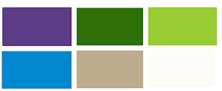
After carrying out my questionnaire, my target audience voted for me to use the colours on the college website as inspiration for the house style for my magazine. These colours are all quite earthy and natural, which connotate calmness or serenity.

Sunday, 10 October 2010

Spider Diagram


This is my spider diagram that I created with my initial reactions to the breif and my image analysis.

Things I'll include in my magazine.

After getting my questionnaire's filled out by students at Wyke Sixth Form Collge there are things that they would like me to include in my college magazine.

-My magazine will be free of charge to all students.
- I will feature up to five of the articles on the cover that students voted for:
Current isues, exam tips, Problem page, Student written articles.
-I will try and use purple, white and green to establish my house style.
- I will use a student's photo for the main image on my cover.

Thursday, 7 October 2010

Questionnaire Results

College Magazine Self-Report.

Which college year are you in?

1st   |||   2nd  |||||||    3rd +

Most Popular answer: 2nd Year

What level courses are you studying?

  As    ||    A2       |||     Both As and A2  ||||  Btec
  Btec and As         Btec and A2          GCSE    |||    Other

Most Popular answer: Both As and A2


What Courses are you studying?
­­_____________________________________

Do you know if this college currently has a magazine?

Yes   ||   No   ||| Don’t Know |||||

Most Popular answer: Don'tKnow

How much do you think students should have to pay for it?

Free  ||||||||||               50p                  £1           £2+

Most Popular answer: Free

What kind of thing would you like to be included in the magazine?

Exam tips  ||||             schedule of upcoming events  ||     Info on Courses

Info on Enrichment       Help with H.E    ||                         Current Issues |||||||

Gossip   |||                       The college menu|                           Examples of students’ work |

Problem Page  ||||            Info on travelling to college              A list of facilities on campus|||

Photo gallery pages ||        Sex education                             Info on drugs & alcohol

Competitions   ||                   Student aimed adverts  |||              Teacher written articles

Student written articles ||||      Contacts  |                             Suggestions for improvements  |       

Articles by student exec    Info on other colleges                 How to manage your free time ||

Five most popular answers: Current isues, exam tips, Problem page, Student written articles

Is there anything that was not mentioned on this list that you would want to be included in the college magazine?

__________________________________________________________


What colour scheme would you like to see used in the magazine?

Green, white & purple to match the college website  |||||                                  Neon colours |||

A different one each week   ||                                       Other( Please specify)       _______

Most popular answer: Green, white & purple to match the college website

What would you like to be used as the main image on the cover of the magazine?

A student’s photo  |||||||          A photo of the college campus  |        A photo of a teacher

A photo of the principal  |     A photo of an academic lesson          A photo of a student’s art

A photo of a perf. Arts lesson |   A photo of a sports lesson                A photo of the student exec

A drawn image                       A photo of nature                               The college logo


Most popular answer: A student's photo


Thankyou.

College magazine conventions.

These are the conventions of college magazines I have discovered from image analysis, and I will use them in my magazine to make it a typical magazine that the target market will recognise and expect.

Masthead: Name of magazine.
Main Image: Mine will be a mid-length close up of a student.
Slogan: To attract target market to magazine. I'm considering using a slogan.
Bar code: I'll use a bar code on my magazine, even though the magazine will be free, I'll use one to count how many are distributed.
Logo: I'll be using the Wyke College Website for further information for students.
Date: So students know if the information is relevent and when it was distributed

Image Analysis


Institution: Grimsby Institute of further and higher education.

Audience: Students aged 16-18 years old.

Cover

Masthead:
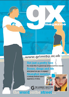
'GX Magazine' is written on the top right of the text. I think that this gives the masthead a bit of a modern twist as it isn't in the centre, although it isn't a huge change to usual college magazine mastheads I think it makes it look a bit more young and funky- A component I may consider using myself. The masthead is the largest thing on the cover other than the main image which instantly draws attention just because it's so large. Block font has been used which seems quite striking and in your face, which I like. The block font connotates high energy, excitment and gives an element of fun which is perfect to attract the target audience. It does this whilst still maintaining a professional feel and in no way looks cheap or tacky. Similar to the East Riding College Magazine I analysed, a white colour has been used for the masthead. Like I've said in a previous blog, white connotes innocence or purity. However in this case I think that it is used to connote coolness and crispness in a simple yet effective way. This component has been superimposed on the image, which I am thinking of doing on my magazine also. The actual title of the magazine draws the audience in as it is called 'GX' it connotates youth as it is almost text slang and teenage students will relate to this.

Main Image:
The main image has been edited to a degree I don't really like. The image looks cartoon-like and although it sticks to the fun, funky image the magazine has been created; I think it's almost too childish and looks a bit crude. The colours used are bright and appealing to will definately attract the target audience to the image. As well as this the colours of the main image match well together, mainly blue, grey, white and an orange colour is used which connotates cool, high-energy, intelligence and vibrance which are things that most students are. The image is essentially the cover and everything else is superimposed on to it, I like this idea as it makes everything seem put together and thought about. This idea also makes everything seem inter-related and not at all random or spontaneous.

Slogan:
Most college magazines don't have a slogan as they tend to maintain a more educated, proffesional look, however this one does. 'The word on the street' the slogan makes the magazine seem exclusive and secretive, which will make students more attracted to the magazine as it creates the idea that you will be the 'in-crowd' or 'in-the-know' if you read this magazine. Slogans are essentially snappy titles and give emphasis to the magazine. They are usually seen in celebrity weekly magazines or in music magazines. I will consider using a slogan on my magazine as I think this text has proved that you can create a fun, high energy theme whilst still communicating an educational and appropiate college magazine feel.


Logo:
The logo on this magazine cover is very small is placed towards the bottom of the page. I think this is a good idea as it doesn't take any emphasis or attention away from the main image, masthead or any relevant information on the cover.

Website:
The website has been placed on the magazine to give the target audience a place for extra information if they need or want it. I will put the institutes website on my college magazine as I think it's a good idea to do so.

House Style:
The house style uses a variety of colours but still looks put-together and organised. It uses blues,greys,whites and an orange colour which connotates cool, high-energy, intelligence and vibrance which are things that most students are.I think that the way the cover is laid out is easily understandable and simple yet fun and youthful. I like the anchorage at the bottom of the page with the main article titles. They give the audience a preview of what is in the magazine and relate to the target audience as they are current issues students are faced by- which is a good thing as it is a student aimed magazine. The fonts used on the text are all very similar. They are quite straight cut which connotates professionalism without being too formal or high-class. Although they're similar there are subtle differences in the font of the slogan, the font of the masthead and the font of the article titles, which I intend to do for my magazine.

I really like this cover as it's young, fun, funky and will attract to the target audience because of the colour and style used. This has been my favourite cover I have analysed so far although I really dislike the main image as it seems too childish and cartoon-like. I will not consider doing this as I think it makes the original seem unrecognisable also.


Contents Page

House style:
The colour scheme reflects the colours used on the cover a little, but not as much as I would have liked to see. The bright, vibrant colours are still maintianed however with a pink colour too, which like the East Riding College makes it seem quite random and spontaneous. The images look really professional and impressive. They are superimposed on the page, which reflects the anchorage on the cover. The font used is similar to the font used on the cover which creates a house style. This makes the spread recogniseable and associative to the cover. I really like the font used 'Contents' I like the way the pink outlines the white as it makes it look bold and creates a high-energy feel to it. I will consider using something like this on my magazine.

Layout:
I like the way the contents box fills most of the page as it's the most relevant information on the page. I really like the way the creator has made the contents box sort of tranparent allowing the audience to still see the images underneath it, This idea has really inspired me for my college magazine and I think I may use it on my text.


I really like this magazine as a whole, it looks professionally finished and quite impressive. I think the main image on the cover let's it down but I love how it doesn't seem like a really formal, boring and plain college magazine. Instead it creates a fun, hip, modern and young feel to it which obviously really relates to the target audience. This college magazine has really inspired me and I hope to create my magazine to this standard and communicate the same vibe.


Initial Layout Ideas

Institution: Wyke Sixth Form College


Audience: Students from this college. Typically 16-18 year olds. Both male and female. All social groups in college. All ethnicities in collge.

I think I will place my masthead on the top centre of the page as it's usually the first place the audience looks. I will use a large font as I want it to be the most attractive sign on my magazine cover. I hope to stick to the same colours as the college website and logo- which is mainly purple, white and green although I may make them richer to make them more appealine. Purple gives connotations of royalty and luxury and according to surveys 75% of teenagers find purple the most aesthetically pleasing colour, making it an excellent choice for my masthead. I think the anchorage on my text will be superimposed on my image as I want my DTP to fill the cover making it seem quite striking.

Image Analysis


Institution: East Riding College

Audience: Students, probobly aged 16-18. Gender neutral colours are used, therefore no specific gender is being targeted.

Cover

Masthead:
'Student Life' It is written in the top centre of the text which is usually where the audience will look first. The fact it says student instantly addresses the target market. It's written in white which heavily contrasts against the black background; causing it to stand out and draw attention. The colour white gives connotations of innocence or purity. It is also quite a clean, crisp, concise colour which works well within this magazine. White also connotates safety usually sets a positive image. It associates coolness and suggests simpleness. Therefore I think the white works well within this masthead, although it isn't a bright, bold colour to attract students with an age of around 16-18 it's simple, cool nature works in it's favour. The institute has made the decision to use a straight font which gives connotations of professionalism, whilst denying tackiness or cheapness- which perhaps creates a positivive image to the college. However the font could be seen to be too plain or boring to students and may not attract them as much as another font could.

After deciding on my own masthead for my college magazine I may play around with fonts, and ask students to decide on the one they feel the most attracted to as colour, font, style and shades can dramtically change the nature of a magazine.

Main Image:
I think the main image is really well used within this college magazine. It shows presumably students stood in a location which is clearly not within college campus. I think that this would relate to the target audience as it shows that the college takes students out on trips or visits of some kind-which most students would find appealing. The contrast of the photo and the darkness of the people in it almost obscures our vision which connotes a mysterious sense to the image. The way the sunlight peers through the trees makes the place look beautiful which makes the DTP aesthetically pleasing to the audience. Although the darkness of the image teamed with the black background could create negative connotations. As well as this it could be seen by the audience as boring and because it doesn't use a variety of colours it may not attract attention.

Although I must use a photograph of a student in a medium close-up shot, I would like to create an image that us aesthetically pleasing and attracts my main audience. I would like it to look professional, whilst still maintaining a fun feel to it.


Logo:
There isn't a specific logo to the magazine, however the college logo is placed on the bottom right of the text. The logo is quite large and there is no other images or anchorage around it, allowing all attention to be drawn to the logo. The logo just says 'East Riding College' which obviously tells the audience which college the magazine is associated to, and gives the students a place to find further information if needed. The logo- like the masthead is in a white colour, giving connotations of a cool professional look. But could be seen to be too plain and not aesthetically appealing. The rays coming off the right hand side of the logo gives it a more fun feel, and makes the institution seem almost more powerful. In my opinion the logo is too simple and I wouldn't personally be attracted to it.

My college magazine will be for 'Wyke Sixth Form College' therefore I will use their existing logo, althought I may tweak it a little if I feel it doesn't necesarily appeal to my target audience.

Date:
The date of the magazine is placed vertically on the left hand side of the masthead. This is a good idea as the audience's attention is usually instantly drawn to the masthead of a magazine. It is not used as a main component of the magazine but still communicates to the audience when the text was produced for as well as telling the target audience if the information is still relevant or not. Like all the text on this magazine it uses the white colour and same straight-cut font, creating a house style of black and white.


House Style of the cover:  The colour scheme of this cover is black and white, creating a dark tone to the text. Even the main image has a dark contrast to it. Although I think this makes the magazine have professional and simple connotations I don't think that it is pleasing to the eye and I think it is very boring and perhaps too plain- especially for a college magazine. I think that the colours don't jump off the page and would be overlooked at a college and won't relate to students as well as they should.

A question was featured in my questionnaire I carried out as research and many students did say they would like the colour scheme to reflect the colours of the college website. This may make the magazine too plain, however I intend to enhance the colours by making them richer or brighter whilst maintaining the Wyke college colour scheme in order to sucessfully create an appropiate house style.


The word free is on the magazine and I think it's pointless and unnecessary for it to be there. The magazine doesn't have a barcode, therefore making it explicit that it doesn't have a price. However I do understand that perhaps more people would take the magazine if it is made obvious the magazine is free of cost to them.

I think that the layout of the magazine doesn't really include all of the usual conventions of a college magazine. Although it does have a masthead, main image, and a logo there isn't really any relevant anchorage or article titles. In my creation I will include these features as they give a preview of what is featured in the magazine which will compell the target audience of students to read the magazine if they are interested in the articles in the text.
Contents Page


House Style: The colour scheme in the contents page reflects the black and white theme in the cover which would make it recognisable to students and doesn't create a mis-matched magazine which I think looks unproffesional and tacky. However the main focus of this page which is the contents box- telling the audience which number pages the articles are on is a brickt, sickly green. I think this works well as the eye is instantly drawn to it, the colour is really bright and contrasts the black and white; allowing it to stand out from the page. Green gives connotations of harmony, freshness and is the most restful colour for the human eye, therefore I understand why it has been used in a college magazine for students. One limitation of using this colour for the contents box is that; because green hasn't been used on the cover it causes it to look random and was spontaneously placed there.

I want my contents page to look organised and thought about, as oppose to the randomness I get from this text.

Images:  I have quite conflicting ideas for the images in this page of the college magazine. I like the way a vareity has been used which reflect the articles featured in the magazine. This component emphasises the articles and makes it more likely for students to read the magazine if they like the photographs. The black borders of the images reflects the thick white border of the main image on the cover which creates a theme or house style. The images are placed around the page wherever the seem to fit and I think this makes it look quite tacky and rushed, I will experiment with my images and try to place them on my text in a creative way; such as overlap them. This will make the images seem more inter-relatable and may look more aesthetically pleasing but still look professional.

Font: The font used on this page seems to be the same font used on the cover which is good as it makes it seem recognisable and again attributes to the house style. I think they are appropiate of a college magazine, however I may use different fonts for the anchorage and masthead to draw more attention to the headline and make it look unique.