Monday, 7 March 2011

Drafts of double page spread

I decided to use this photograph as it shows a different angle of the artist, it will also look as though she is looking at the text if I place in on the right hand side of the page. Alike the cover image, the artist here is wearing an iconic rockstar look- the woodstock glasses which shows who her inspiration is. I think it's a conventional image to use as it displays her laid back attitude.


Here I have slightly altered the colour of the background on the image. I did this as I thought it made it look more professional and a lot stronger and bolder. I have also added a white rectangular shaped box on the right hand side of the page, I did this so I know where my headline will be super-imposed. It goes slightly on to the artists head, I like this idea as it makes everything on the page connected to eachother.
I have added the headline onto the page and I am extremely happy with it. I like the way the word 'Nothing' is in the white box as it emphasises what she is trying to say by stressing this word. The font of the headline looks faded and edgy which is a convention of rock music. The headline is a direct quote from what the artist has said in the article, this could make the reader want to read on.
I have added the 'Radar' logo into the top left hand side of the double page spread, I did this to maintain my house style and make my spread recogniseable to the target audience. I have also added the date and page number of the article which is an obvious convention of a magazine.


In this draft I have added a strapline which goes underneath my headline. This sums up what the article will be about and gives a little bit of background information of the artist. The words 'Cora Jagger' are in red which makes them stand out from the strapline and your eyes immediately are drawn to them, I did this so the reader will know for sure who the article is going to be about. The red and black text also help maintain my house style.


This is my final draft of my double page spread. I have added in the interview I have written. The questions are in a red font which contrasts with the black answers, it also maintains my house style. I have placed the interview in columns which is a convention of a magazine. I have also added a byline to my page.


I have made further changes to my double page spread, I have outlines the album information in black so it stands out from the rest of the article more. This is the reason that Cora would take part in this interview- to advertise her tour and latest track so I wanted to make it stand out.


Double page spread interview (2nd Draft)

The 1st draft of my interview was much too long. The answers that the artist provided could also make her be seen in a negative light as she swears often and has a bad attitude making her a bad role model. This therefore could affect the sales of the magazine. I have cut down the article and made it more appropiate for my target audience.


Radar: Hi Cora! Welcome to Radar
Cora: Hello! Thanks, for having me guys.

Radar: We love your new single ‘C U Next Tuesday’, tell us the story behind it. Did you write it yourself?
Cora: Thanks very much. Yeah, I write all of my material myself purely because it doesn’t feel like my own if I don’t. I mean if I can’t connect to a track on a personal level then how can I expect my fans to? I really enjoy writing songs too, so I’d be a bit bored if I wasn’t doing that, it’s very therapeutic and allows you to get everything out of your system without looking a bit mental sitting on a psychiatrists’ sofa.

Radar: And what inspired you to write it?
Cora: Everyone who I’ve spoken to about this song thinks that it’s about my boyfriend because most people assume these days that every single song is about love, well I had my dad in mind when I wrote this song (laughs). I’m not saying that my dad is a t**t or anything, but he was just bugging me when I wrote this song as he was trying to manage my music business himself, I mean why wouldn’t he want to? He’s done okay for himself I guess.

Radar: We think he’s done a bit better than okay. Does his music inspire your songs?
Cora: Not in the slightest. I guess you could say that The Rolling Stones weren’t afraid to sing whatever they wanted no matter what anybody thought of them, and I think  I’m a bit like that. My dad will kill me for saying this, but I’ve never liked his music, it’s so overrated. These days people like The Rolling Stones because they are The Rolling Stones and not because of the music, I used to cry when my dad used to play his music to me as a child. My inspirations are David Bowie, I love  him! I met him the other day and was so star struck I nearly fainted, I’d love to marry him. The Beatles are my favourites though, Rock and Roll at it’s very best!
Radar: How has your life changed since your single came out?
My life hasn’t changed drastically, having a famous father means that you are constantly in the spotlight. I hate not being able to go out for a coffee and not have somebody recognise you, and I hate that you always have to look perfect or you’ll be slated. It’s really irritating.


Radar: When’s your album ‘Miss Nothing’ out? And will you be doing a UK tour?
Cora: My album comes out on the 1st January 2011 and I am so excited to see what my fans think of it! My tour starts on the 6th March which gives me some time to prepare myself because I’ve never done anything like it before. The dates are on my website but I’ll be playing in London’s O2 arena, Manchester’s MEN arena, Sheffield, Newcastle, Nottingham, Glasgow all the major places but I’ll be playing some small gigs too like in Camden and Hull, I’m doing Glastonbury next year as well which is an absolute dream come true!

Radar: Thank you so much for talking to us and we’ll talk to you again in our yearly ‘Backstage at the Festivals’ feature later on in the year.
Cora: Thank you so much! It’s been a pleasure speaking to you, I hope I did okay in my first ever interview. I look forward to speaking to you later on in the year, Peace out! (Blows us a kiss)

  • Cora’s debut single ‘C U Next Tuesday’ is out now, and her album ‘Miss Nothing’ is out on the 1st January 2011. Check out our website www.Radar.co.uk for details on her first UK tour and how to win front row tickets.

Wednesday, 2 March 2011

Interview for double page spread (1st draft)

Radar: Hi Cora! Welcome to Radar
Cora: Hello! Thanks, for having me guys.

Radar: We love your new single ‘C U Next Tuesday’, tell us the story behind it. Did you write it yourself?
Cora: Thanks very much. Yeah, I write all of my material myself purely because it doesn’t feel like my own if I don’t. I mean if I can’t connect to a track on a personal level then how can I expect my fans to? I really enjoy writing songs too, so I’d be a bit bored if I wasn’t doing that, it’s very therapeutic and allows you to get everything out of your system without looking a bit mental sitting on a psychiatrists’ sofa.

Radar: So for those who haven’t heard the song yet, what is it all about?
Cora: I think that this song can mean something different to everyone because we have all had different experiences, and I love that about this song because everyone can treat it how they like. I guess it’s about standing up for yourself and not taking s**t from the p**k everyone has in their life.  I mean the title says it all doesn’t it?

Radar: And what inspired you to write it?
Cora: Everyone who I’ve spoken to about this song thinks that it’s about my boyfriend because most people assume these days that every single song is about love, well I had my dad in mind when I wrote this song (laughs). I’m not saying that my dad is a c**t or anything, but he was just bugging me when I wrote this song as he was trying to manage my music business himself, I mean why wouldn’t he want to? He’s done okay for himself I guess.

Radar: We think he’s done a bit better than okay. Does his music inspire your songs?
Cora: Not in the slightest. I guess you could say that The Rolling Stones weren’t afraid to sing whatever they wanted no matter what anybody thought of them, and I think  I’m a bit like that. My dad will kill me for saying this, but I’ve never liked his music, it’s so overrated. These days people like The Rolling Stones because they are The Rolling Stones and not because of the music, I used to cry when my dad used to play his music to me as a child. My inspirations are David Bowie, I love  him! I met him the other day and was so star struck I nearly fainted, I’d love to marry him. The Beatles are my favourites though, Rock and Roll at it’s very best!

Radar: How would you describe your songs?
Cora: I think that they’re very opinionated, but that’s just me. I’m not the kind of girl just to sit back when somebody’s wrong, but I’m not nasty either. My songs can relate to everyone, and I think they’re quite cool, but I’m biased obviously.

Radar: What would you say to your critics who say that you swear too much in your songs?
Cora: What? People say that? I would tell them to shut the  f**k up! (Laughs) I’ve never got the big deal with swear words, they’re just words.  It’s not like we live in the 19th century, people swear and if I want to connect to them and express my feelings in my songs then I’ll use them too. Critics have just got a stick up their a**e and I don’t really care what they think.

Radar: People have said in the past that you have a bad attitude, why do you think you come across that way?
Cora: I don’t know really. Ever since I was small I’ve always had tough skin because no matter which career I chose I was going to be in the spotlight and maybe I come across a b***h and defensive but I am not those things at all. I love spending time with my friends, and I love my boyfriend more than anything, I’m a normal 19 year old girl at heart but when you’ve grown up in the public eye it’s difficult to trust who is your friend because of your personality or because they want five minutes of fame so I guess you could say that I can have a bit of an attitude problem at times, but I’ve a wicked sense of humour to match (laughs)

Radar: When’s your album ‘Miss Nothing’ out? And will you be doing a UK tour?
Cora: My album comes out on the 1st January 2011 and I am so excited to see what my fans think of it! My tour starts on the 6th March which gives me some time to prepare myself because I’ve never done anything like it before. The dates are on my website but I’ll be playing in London’s O2 arena, Manchester’s MEN arena, Sheffield, Newcastle, Nottingham, Glasgow all the major places but I’ll be playing some small gigs too like in Camden and Hull, I’m doing Glastonbury next year as well which is an absolute dream come true!

Radar: We love your album and have rated it the best album we’ve heard in a long time! Thank you so much for talking to us and we’ll talk to you again in our yearly ‘Backstage at the Festivals’ feature later on in the year.
Cora: Thank you so much! It’s been a pleasure speaking to you, I hope I did okay in my first ever interview. I look forward to speaking to you later on in the year, Peace out! (Blows us a kiss)

  • Cora’s debut single ‘C U Next Tuesday’ is out now, and her album ‘Miss Nothing’ is out on the 1st January 2011. Check out our website www.Radar.co.uk for details on her first UK tour and how to win front row tickets.

Monday, 28 February 2011

Digital drafts of double page spread


A digital draft of what I want my double page spread to look like. It is quiote simple so the main image will be the main focus.

Wednesday, 15 December 2010

Contents page drafts


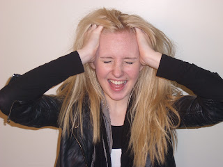
This is the original photograph I have used for my contents page. I decided to use it because it looks as though the artist is screaming and is fed up of fame perhaps which is the attitude I wanted to communicate. As well as this, the pose reflects a rock star's stereotypical attitude which was what I wanted to achieve.


I have edited the background on this photograph to be in a blocked grey colour. I did this to make the image more edgy and urban, also to make it look a lot bolder which will focus the target audience's attention.


Before super imposing the photograph on to the contents page I made a banner to go along the top of the text. I used red for the banner in order to maintain the house style I created on my cover. Also, the colour red will catch the eye of the reader and it makes a loud statement about this page. I have re-used the masthead from my cover page so the reader will recognise it and to emphasise my house style.
The white colour of 'This Week' contrasts from the red banner and I also used the same font as some of the anchorage on my cover page to keep my magazine consistent.
I have placed the date the magazine will be distributed on the banner so the reader knows that the information in this magazine is relevant and fresh.
I added the photograph onto the contents page underneath the banner as it will probably be the first place the reader will look- meaning that this will be the most popular article. I super imposed a white box onto the photograph and typed all the details about where to find the article and a caption telling the reader further information which is a convention of a music magazine.
I outlined the photograph in black to make it stand out further and maintain my house style.


I have begun to start adding the articles in my magazine down the right hand side of the page. I have also organised them into different sections which is a convention of a music magazine.


Here I have added more articles to the contents page down the right hand side. I have also outlined the page number of the Cora Jagger article in black to give it emphasis, as well as this I have changed the colour of the caption to red to make it stand out.

I have created a subscription advertisement on the bottom of the page which many magazines have to create interest in their magazine and to boost their purchase rate. I put the subscription in a black box to contrast with the white background and created it to look exactly like other subscription ads I have seen in other magazines.


I have finally finished putting the articles on my contents page . I have also added minor details to my contents page to make it seem more professional such as the page number and the small 'Radar' logo on the bottom right of the page.


I thought I had finished my contents page in this draft. I have added an editor's box in which the editor of the magazine writes a column in every issue telling the reader background information about an artist or a piece of interesting trivia that happened whilst the magazine was in publishing. I think that I made this box look professional and even included the editor's signature. As well as this, the text in the editor's box relates to the cover star in order to make my magazine consistent.


 Here I have edited ther text in the editor's box. I didn't think that it made sense as the sentences were a little too complex and didn't really say anything interesting. I have also changed the last article on the bottom of the page to make it seem like Cora Jagger has given each reader a free sample of her new single which will draw in more readers and boost magazine sales.


Digital and drawn draft of contents page


A digital draft of what I want my contents page to look like, this makes it easier for me to create my contents page and expand on any existing ideas I already had.

Cover Drafts


 Here I have added my masthead to the top left of the cover. I placed it in this position as it is conventional to do so as not only were we taught to read from the left side of the page but also because of the way magazines are positioned on a shelf. I think that the masthead is the perfect size for the cover as it is large enough to stand out and grab attention but not too big so that it detracts any attention from the cover star. The masthead could be placed behind the artists head when it becomes a more recogniseable logo and a more established magazine.
Underneath the masthead I have superimposed the magazines website to give the audience any further information on the magazine. I have placed it in this position as it will be easy to find for the reader. The barcode is in the bottom right of the page which is convnetional and I have placed the price of £2.80, the issue number of 1000 and the website onto the barcode itself.


I have changed the colour of the website from black to red to help emphasise the red and black house style I will establish, it also causes the website address to stand out from the masthead and white background. I have removed the barcode because I am not completely happy with it's position or size so have decided to wait until I have an idea of the positioning of my anchorage before I superimpose the barcode on to my cover. I have placed a black box with red outline at the bottom of the text with extra things the magazine will include which is a convention of a rock magazine, it also helps emphasise my house style.
I have created a banner headline for my cover here stating the artist's name. I have done this to directly tell the target audience who the artist is. The red colour is bright and vibrant which strongly contrasts with the black and white image. The square cuts the image in half almost and creates an edgy effect. The font used for 'Cora Jagger' I found on a font website and looks edgy and urban which I thought was perfect for the artist. The white stands out from the red banner and is easy to read and understand.


I have superimposed two images of Cora Jagger onto the text. I edited these images using photoshop to give them the brightly coloured backgrounds they have, I chose to do this as it gives the images a fun yet cool feel to them and allows them to stand out from the black and white photograph. I outlined them in black to make them stand out further and have placed them in a staggered position to create a rough look however I am not quite sure if it makes the cover seem too scruffy or unprofessional.

I have also made the lightning bolt even brighter to reflect the other vibrant colours I have used on the cover. It now also demands more attention from the reader.


I have added the date the magazine is to be distributed underneath the website address on my cover so the target audience will know that the information in this magazine is current and relevant, it will also be useful to those people who collect magazines. I eventually decided to place the two images of Cora Jagger underneath one another as I thought it created a more professional feel to the cover. I have seperated the images with a black box (which helps establish my house style) and used red and white font to tell the reader there is a poster special inside the magazine which again is a convention of some rock magazines.
I have finally added in a barcode to my cover as I am now confident in where I want it to be placed. On the barcode I have placed the issue number which I now have changed to 10 as it is a new magazine, The price which is still £2.80, the dates that the magazine is valid and the website address. I have used red and black coloured font to create a consistent house style and to create a mix-matched rough feel to the cover.

 I have added some anchorage on to my cover. The words 'World Exclusive' is typical journalistic lexis which suggests to the audience that the only place they will hear this information is inside this magazine which could persuade somebody to purchase the text. The anchorage is in black which contrasts with the black and white image. The font used is quite slanted which creates a rough, edgy feel to the cover without being too scruffy and unprofessional. I have also created a strapline underneath the banner headline which is in white font and outlined thickly in black in order to make it stand out. The strapline hints towards what the article will be about and is a direct quote from the artist so establishes her attitude. The strapline also relates to the fact she has a famous father and could therefore reach to a wider demographic.


I have added some more anchorage onto my cover in the form of two articles which will appear in my magazine. The style I have placed these onto my text is the band or artist name and then a direct quote from them to tell the reader what the article will be about and to also give them a hint of what their attitudes are. I have used the words 'Featuring' and 'Exclusive' to make it seem as though like the article with Cora Jagger this information cannot be found anywhere else other than this magazine. 
I am not completely happy with the positioning of this anchorage on my cover as it looks a little incomplete and too 'mis-matched' so I will have to experiment with this. 


Here I have outlined the words 'Poster Special' in red so it stands out more and puts emphasis on the fact that there will be posters inside this text.