I was happy with the photographs I had taken but had decided that I wanted more of an iconic look for the artist. I thought that because I had made the artist wear 'woodstock' glasses to look as if she is iunfluenced by John Lennon then I would create a similar look to David Bowie's lightning bolt on the artists face whilst still maintaining a unique style. Although the make-up doesn't really stand out in these photos I will edit it to make the make-up the focal point of the photograph. I took both sets of photographs in a room at college with plain white walls, I made this decision as it would make the DTP's easier to edit later; especially if I wanted to change the colour of the background. I decided for the model to wear a leather jacket to emphasise the rock style of the magazine and quite ordinary clothes to show that you don't have to purchase or wear really expensive, outrageous clothes to be a rock star.

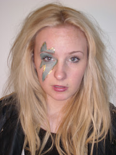
I like this photograph as the artist is stood facing the camera which allows the audience to fully recognise who the picture is of. The artist is stood in a natural pose which could reflect her laid-back attitude. The way the artist is facing the camera it allows us to see the lightning stripe on her face and doesn't take away any unnecessary focus away from this. The medim close-up allows the audience to feel personally close to the artist without creating an uncomfortably close feel an extreme close-up would produce for example.This DTP could be seen as quite boring, however I think that it is the perfect piture to use for my cover image.
This close-up shows that the main focus of the image is the lightning bolt on the artists face; highlighting that the topic of the article will be about the artists' inspirations. I think that a close-up is the wrong shot to use for my cover image as the masthead and other anchorage that I will put onto my magazine cover will hide parts of her face which will make the artist unrecogniseable to the artist and will look messy and unprofessional.

I don't like the artists hair or facial expression is this photograph, however I like the camera angle and shot and will consider using a similar picture for my cover image.

I really like the pose in this photograph as it's different to what you usually see on a magazine cover, making it unconventional. The plaster on the artists hand ruins the shot and if I were to use this then I would be forced to edit the plaster out of the shot. I think that this would be better to use as the image for my double page spread or contents page as the anchorage and masthead I will be placing on my cover would cover her face and hands.

I would not use this photograph for my cover image as it would be difficult to see who the artist is due to the camera angle- meaning that magazine sales for this issue could possibly decrease because of this. I do like how the painting on her face is close to the camera as it allows us to identify this image with the iconic look from David Bowie. I will not be using this for my cover image.

I really like this image as the facial expression the artist is giving as it can communicate many ideas to the audience. It could imply that the artists is perhaps fed up of being photographed and the way that the lips are pursed slightly it seems as though she is about to say something aggressive or angry which could reflect her rock star status.
 The pose in this photograph is natural and I don't think is 'rock-star' enough for my cover as it doesn't show any attitude etc. The colour to the photograph has a blue tint to it which could be enhanced in editing which will create an unwanted weird effect to the image.

I like this photograph as the artist is stood facing the camera which allows the audience to fully recognise who the picture is of. The artist is stood in a natural pose which could reflect her laid-back attitude. The way the artist is facing the camera it allows us to see the lightning stripe on her face and doesn't take away any unnecessary focus away from this. The medim close-up allows the audience to feel personally close to the artist without creating an uncomfortably close feel an extreme close-up would produce for example.This DTP could be seen as quite boring, however I think that it is the perfect piture to use for my cover image.

This close-up shows that the main focus of the image is the lightning bolt on the artists face; highlighting that the topic of the article will be about the artists' inspirations. I think that a close-up is the wrong shot to use for my cover image as the masthead and other anchorage that I will put onto my magazine cover will hide parts of her face which will make the artist unrecogniseable to the artist and will look messy and unprofessional.

I don't like the artists hair or facial expression is this photograph, however I like the camera angle and shot and will consider using a similar picture for my cover image.

I really like the pose in this photograph as it's different to what you usually see on a magazine cover, making it unconventional. The plaster on the artists hand ruins the shot and if I were to use this then I would be forced to edit the plaster out of the shot. I think that this would be better to use as the image for my double page spread or contents page as the anchorage and masthead I will be placing on my cover would cover her face and hands.

I would not use this photograph for my cover image as it would be difficult to see who the artist is due to the camera angle- meaning that magazine sales for this issue could possibly decrease because of this. I do like how the painting on her face is close to the camera as it allows us to identify this image with the iconic look from David Bowie. I will not be using this for my cover image.

I really like this image as the facial expression the artist is giving as it can communicate many ideas to the audience. It could imply that the artists is perhaps fed up of being photographed and the way that the lips are pursed slightly it seems as though she is about to say something aggressive or angry which could reflect her rock star status.


No comments:
Post a Comment