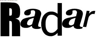
I have decided not to use this font because it looms quite unprofessional. I do like how futuristic it looks but I think it's a bit too thick and sqaured as a font.
I really like this font and have decided to use it. The main reason is because it will be recogniseable to the target audience as it's the same font 'The Sex Pistols' used on one of their albums. Because this band is a rock band it will emphasise my magazine as a rock magazine.
I like this font however I don't like the way it's lowecase letters and I don't think it will create enough attention.
I like this font as it's similar to the 'Kerrang' masthead. However it isn't very easy to read and may put the target audience off purcahsing the magazine. It does reflect the messy style of rock music.
This font is quite eye catching to the audience, is clear to read however the letters are quite narrow and long and may take up too much space on my magazine cover.


No comments:
Post a Comment