Wednesday, 15 December 2010

Contents page drafts


This is the original photograph I have used for my contents page. I decided to use it because it looks as though the artist is screaming and is fed up of fame perhaps which is the attitude I wanted to communicate. As well as this, the pose reflects a rock star's stereotypical attitude which was what I wanted to achieve.


I have edited the background on this photograph to be in a blocked grey colour. I did this to make the image more edgy and urban, also to make it look a lot bolder which will focus the target audience's attention.


Before super imposing the photograph on to the contents page I made a banner to go along the top of the text. I used red for the banner in order to maintain the house style I created on my cover. Also, the colour red will catch the eye of the reader and it makes a loud statement about this page. I have re-used the masthead from my cover page so the reader will recognise it and to emphasise my house style.
The white colour of 'This Week' contrasts from the red banner and I also used the same font as some of the anchorage on my cover page to keep my magazine consistent.
I have placed the date the magazine will be distributed on the banner so the reader knows that the information in this magazine is relevant and fresh.
I added the photograph onto the contents page underneath the banner as it will probably be the first place the reader will look- meaning that this will be the most popular article. I super imposed a white box onto the photograph and typed all the details about where to find the article and a caption telling the reader further information which is a convention of a music magazine.
I outlined the photograph in black to make it stand out further and maintain my house style.


I have begun to start adding the articles in my magazine down the right hand side of the page. I have also organised them into different sections which is a convention of a music magazine.


Here I have added more articles to the contents page down the right hand side. I have also outlined the page number of the Cora Jagger article in black to give it emphasis, as well as this I have changed the colour of the caption to red to make it stand out.

I have created a subscription advertisement on the bottom of the page which many magazines have to create interest in their magazine and to boost their purchase rate. I put the subscription in a black box to contrast with the white background and created it to look exactly like other subscription ads I have seen in other magazines.


I have finally finished putting the articles on my contents page . I have also added minor details to my contents page to make it seem more professional such as the page number and the small 'Radar' logo on the bottom right of the page.


I thought I had finished my contents page in this draft. I have added an editor's box in which the editor of the magazine writes a column in every issue telling the reader background information about an artist or a piece of interesting trivia that happened whilst the magazine was in publishing. I think that I made this box look professional and even included the editor's signature. As well as this, the text in the editor's box relates to the cover star in order to make my magazine consistent.


 Here I have edited ther text in the editor's box. I didn't think that it made sense as the sentences were a little too complex and didn't really say anything interesting. I have also changed the last article on the bottom of the page to make it seem like Cora Jagger has given each reader a free sample of her new single which will draw in more readers and boost magazine sales.



Digital and drawn draft of contents page


A digital draft of what I want my contents page to look like, this makes it easier for me to create my contents page and expand on any existing ideas I already had.

Cover Drafts


 Here I have added my masthead to the top left of the cover. I placed it in this position as it is conventional to do so as not only were we taught to read from the left side of the page but also because of the way magazines are positioned on a shelf. I think that the masthead is the perfect size for the cover as it is large enough to stand out and grab attention but not too big so that it detracts any attention from the cover star. The masthead could be placed behind the artists head when it becomes a more recogniseable logo and a more established magazine.
Underneath the masthead I have superimposed the magazines website to give the audience any further information on the magazine. I have placed it in this position as it will be easy to find for the reader. The barcode is in the bottom right of the page which is convnetional and I have placed the price of £2.80, the issue number of 1000 and the website onto the barcode itself.


I have changed the colour of the website from black to red to help emphasise the red and black house style I will establish, it also causes the website address to stand out from the masthead and white background. I have removed the barcode because I am not completely happy with it's position or size so have decided to wait until I have an idea of the positioning of my anchorage before I superimpose the barcode on to my cover. I have placed a black box with red outline at the bottom of the text with extra things the magazine will include which is a convention of a rock magazine, it also helps emphasise my house style.
I have created a banner headline for my cover here stating the artist's name. I have done this to directly tell the target audience who the artist is. The red colour is bright and vibrant which strongly contrasts with the black and white image. The square cuts the image in half almost and creates an edgy effect. The font used for 'Cora Jagger' I found on a font website and looks edgy and urban which I thought was perfect for the artist. The white stands out from the red banner and is easy to read and understand.


I have superimposed two images of Cora Jagger onto the text. I edited these images using photoshop to give them the brightly coloured backgrounds they have, I chose to do this as it gives the images a fun yet cool feel to them and allows them to stand out from the black and white photograph. I outlined them in black to make them stand out further and have placed them in a staggered position to create a rough look however I am not quite sure if it makes the cover seem too scruffy or unprofessional.

I have also made the lightning bolt even brighter to reflect the other vibrant colours I have used on the cover. It now also demands more attention from the reader.


I have added the date the magazine is to be distributed underneath the website address on my cover so the target audience will know that the information in this magazine is current and relevant, it will also be useful to those people who collect magazines. I eventually decided to place the two images of Cora Jagger underneath one another as I thought it created a more professional feel to the cover. I have seperated the images with a black box (which helps establish my house style) and used red and white font to tell the reader there is a poster special inside the magazine which again is a convention of some rock magazines.
I have finally added in a barcode to my cover as I am now confident in where I want it to be placed. On the barcode I have placed the issue number which I now have changed to 10 as it is a new magazine, The price which is still £2.80, the dates that the magazine is valid and the website address. I have used red and black coloured font to create a consistent house style and to create a mix-matched rough feel to the cover.

 I have added some anchorage on to my cover. The words 'World Exclusive' is typical journalistic lexis which suggests to the audience that the only place they will hear this information is inside this magazine which could persuade somebody to purchase the text. The anchorage is in black which contrasts with the black and white image. The font used is quite slanted which creates a rough, edgy feel to the cover without being too scruffy and unprofessional. I have also created a strapline underneath the banner headline which is in white font and outlined thickly in black in order to make it stand out. The strapline hints towards what the article will be about and is a direct quote from the artist so establishes her attitude. The strapline also relates to the fact she has a famous father and could therefore reach to a wider demographic.


I have added some more anchorage onto my cover in the form of two articles which will appear in my magazine. The style I have placed these onto my text is the band or artist name and then a direct quote from them to tell the reader what the article will be about and to also give them a hint of what their attitudes are. I have used the words 'Featuring' and 'Exclusive' to make it seem as though like the article with Cora Jagger this information cannot be found anywhere else other than this magazine. 
I am not completely happy with the positioning of this anchorage on my cover as it looks a little incomplete and too 'mis-matched' so I will have to experiment with this. 


Here I have outlined the words 'Poster Special' in red so it stands out more and puts emphasis on the fact that there will be posters inside this text.


Name

I have decided to research into what I want to call my artist as the name can reflect what kind of music she produces and the attitude she wants to communicate to the audience. I think that if I chose an ordinary name then it could cause my magazine to look unreaslistic and unprofessional.

-Daisy
-KT
-Cora
-Mischa

I have chosen the name Cora as it is an unusual name and sounds like a realistic rockstar's name. I wish to give my artist the last name of an already famous rockstar as people are more likely to recognise her is she is the daughter of an existing artist. As well as this, it may cause more people to purchase the magazine as they like the cover star's parents.

-Cora Lennon (after John Lennon from The Beatles)
-Cora Morrison (after Jim Morrison from The Doors)
-Cora Jagger (after Mick Jagger from The Rolling Stones)
-Cora Morrisey (after Steven Morrisey from The Smiths)
-Cora Daltrey (after Roger Daltrey from The Who)

The name I have chosen is Cora Jagger. I did this because a few of Mick Jagger's children are already famous in their own right e.g Georgia Jagger the model. This means that the surname could apply to an extended demographic. The name has a good ring to it and has the right sound I want for my rock music magazine.

Monday, 13 December 2010

Band names.

In order to keep my magazine truly original I have decided to create every single band or artist name in my magazine. I will attempt to ensure these names reflect the rock genre of my magazine.

-The Somethings
-The Stiffs
-Not Another Code Red
-The Answer
-Lucy In The Sky
-The Sex Brigade
-Milo Davies

Digital and drawn mock-ups of cover page

This is a mock up of an idea of what I may want my cover to look like. It includes many conventions of a rock magazine however I will want to play around with the things on the page to get an interesting effect.

Friday, 10 December 2010

Colour connotations/ house style

I would like to use bright, vibrant colours for my established house style on my front cover. I have chosen to do this as the colours could reflect the aggressive and big attitude sense that rock music connotes. As well as this bright colours will catch the readers eye and will provide an aesthetically pleasing style which could persuade them to purchase the magazine. The colours will stand out from the page and will contrast to other magazines on the shelf.

I possibly wish to use black and red for my house style as they contrast from one another and are typical rock magazine colours to use as seen from previous research. I will then add in other bright colours such as blue or yellow however they will not be as dominant as red and black and may not be present in my contents page or double page spread.

Black
Black is associated with power, death and the colour is associated with mystery and fear. Although it usually has negative connotations is gives the idea of strength and authority. Black contrasts very well with bright colours which is what I want and when paired with red it can create a very agressive colour scheme.


Red
Red is associated with energy, danger, strength and power. This colour is very intense and studies show that it can enhance metabolism, increase respitation rate and blood pressure causing an exciting and exhillerating feel. This colour has high visablilty and brings text and images into focus. As well as this red is thought to stimulate people which could persuade them to purchase my magazine.

Development of cover image.


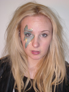
I eventually chose to use this photograph as it shows attitude, and highlights her rock-star status, however it also shows that she's quite laid back through her natural pose. The pose is conventional of other rock magazines as their cover stars also stand in natural poses. The artist is facing the camera and is therefore recogniseable and allows us to feel close on a personal level to the artist.

I have edited the lightning bolt on her face and made it look as if it is a richer more vibrant colour than in the previous photograph. I did this because it allows the stripe to draw more attention from the audience and makes it appear more noticeable.

I have changed the photograph into black and white as it is an unconventional method in a rock magazine and could possibly allow my cover to stand out from other magazines on a shelf.

I have turned the lips back into their original colour as I thought that the plain black and white image seemed quite boring and took away some of the attitude of the photograph.


I have made the contrast and brightness to this image higher as it has created an ediger look to the photograph and makes it seem like it belongs in a rock magazine. As well as this it makes the image brighter which will demand more attention from the audience. I have also turned the lightning stripe into its original colour as it makes it look more noticeable and shows that the stripe is the main focus of the DTP.

Photographs 2

I was happy with the photographs I had taken but had decided that I wanted more of an iconic look for the artist. I thought that because I had made the artist wear 'woodstock' glasses to look as if she is iunfluenced by John Lennon then I would create a similar look to David Bowie's lightning bolt on the artists face whilst still maintaining a unique style. Although the make-up doesn't really stand out in these photos I will edit it to make the make-up the focal point of the photograph. I took both sets of photographs in a room at college with plain white walls, I made this decision as it would make the DTP's easier to edit later; especially if I wanted to change the colour of the background. I decided for the model to wear a leather jacket to emphasise the rock style of the magazine and quite ordinary clothes to show that you don't have to purchase or wear really expensive, outrageous clothes to be a rock star.


I like this photograph as the artist is stood facing the camera which allows the audience to fully recognise who the picture is of. The artist is stood in a natural pose which could reflect her laid-back attitude. The way the artist is facing the camera it allows us to see the lightning stripe on her face and doesn't take away any unnecessary focus away from this. The medim close-up allows the audience to feel personally close to the artist without creating an uncomfortably close feel an extreme close-up would produce for example.This DTP could be seen as quite boring, however I think that it is the perfect piture to use for my cover image.

This close-up shows that the main focus of the image is the lightning bolt on the artists face; highlighting that the topic of the article will be about the artists' inspirations. I think that a close-up is the wrong shot to use for my cover image as the masthead and other anchorage that I will put onto my magazine cover will hide parts of her face which will make the artist unrecogniseable to the artist and will look messy and unprofessional.

I don't like the artists hair or facial expression is this photograph, however I like the camera angle and shot and will consider using a similar picture for my cover image.

I really like the pose in this photograph as it's different to what you usually see on a magazine cover, making it unconventional. The plaster on the artists hand ruins the shot and if I were to use this then I would be forced to edit the plaster out of the shot. I think that this would be better to use as the image for my double page spread or contents page as the anchorage and masthead I will be placing on my cover would cover her face and hands.

I would not use this photograph for my cover image as it would be difficult to see who the artist is due to the camera angle- meaning that magazine sales for this issue could possibly decrease because of this. I do like how the painting on her face is close to the camera as it allows us to identify this image with the iconic look from David  Bowie. I will not be using this for my cover image.

I really like this image as the facial expression the artist is giving as it can communicate many ideas to the audience. It could imply that the artists is perhaps fed up of being photographed and the way that the lips are pursed slightly it seems as though she is about to say something aggressive or angry which could reflect her rock star status.
The pose in this photograph is natural and I don't think is 'rock-star' enough for my cover as it doesn't show any attitude etc. The colour to the photograph has a blue tint to it which could be enhanced in editing which will create an unwanted weird effect to the image.

I like the way that the artist is leaning toward the right side as it would allow me to superimpose anchorage and a masthead on the blank space in the image. However alike the photo above there is a blue tint to the image which could ruin the DTP in editing.

Photographs.

I have taken a wide variety of photographs of my artist in various poses to ensure I have a large choice for my cover, contents page and double page spread.